You know that feeling when you walk into a room and can’t explain why it feels flat… or oddly tense? I’ve been in a lot of Orange County homes where the layout was fine, the furniture was fine – yet the room felt off. Nine times out of ten, it was the paint. Color is the quiet boss of the house. It calms kids, makes small rooms feel bigger, and even helps you sleep. I’ll be honest: I still second-guess a shade now and then. That’s normal. The trick is how you test, where you use it, and the finish you pick.
What Color Does to a Room (That You Can Feel)
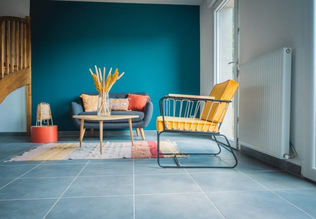
Here’s the simple way I explain it to clients as a painting handyman: warm colors – soft whites, creams, sand, clay – pull a room closer and make it feel like it’s saying, “come sit down.” Light blues, light greens, and misty grays, cool colors, move the walls away and put in air, as the room is commanding you to take a breath. You will know it immediately without necessarily having to identify the reasons why.
I’ve seen this play out across Orange County. In a Dana Point living room with steady north light, a trendy gray went muddy by noon. We repainted in a warm white with a small beige tint – about ten percent – and nothing else changed: same sofa, same rug. The whole space finally felt awake.
In a bright Costa Mesa nursery, the parents were set on “lighter and brighter,” but the sun was already doing the heavy lifting. A muted sage calmed the glare, and they told me the baby slept better. A narrow Huntington Beach hallway felt tight and shadowy until a pale blue-gray with higher light bounce made the passage read wider – no carpentry required, just the right tone.
Life Hacks That Save Repaints
Start here when you want fewer surprises:
- Test big, at eye level. Roll two coats on sample boards or right on the wall.
- Check the bulbs. Warm bulbs make colors creamier; cool bulbs can wash them out.
- Watch the floors. Oak with orange tones can push whites pink. Concrete can push grays cold.
- Mind the sheen. Matte hides flaws, eggshell/satin cleans easier, semi-gloss pops trim.
- Use restraint with accent walls. One bold wall is fun… three bold walls is a headache.
Finish & Light: The Mood Shifters People Forget
Small choices here change how any color behaves. Keep ceilings flat or matte to hide waves and seams. Go matte or eggshell on most walls for a soft look, and switch to satin where you’ll be wiping a lot. Use semi-gloss on trim and doors so details pop. And remember: the same shade reads warmer in shade and cooler in full sun – another reason to test before you commit.
Common Mistakes We See (and Fix)
Avoid these and you’ll skip a redo:
- Picking in the store. Store lights lie. Test at home.
- Too many undertones. Pinkish beige next to greenish gray = quiet chaos.
- Skipping prep. Shiny old paint needs a scuff and sometimes primer, or new paint slides around.
- Forgetting the furniture. Match the bossiest item in the room (sofa, rug) before anything else.
If all this feels like a lot, that’s what our crew does daily as part of our full services – we test, tweak, and make the call with you, on site.
Conclusion: Color That Feels Right, Every Day
You don’t need a design degree to get this right. You need big samples, honest light, and a plan. Start with one room that bugs you the most. Get two or three big swatches, and spend a weekend with them, and observe the reaction of your family. If you want a steady hand, we’re here. Our local team picks colors, samples them with you, and handles the taping, prep, and clean-up so you can keep your week sane. Ready to feel the change? Submit a request, read more on our site, or contact us to book our handyman services today!